In January I spent two weeks in Yellowstone. At the time I was feeling inspired… almost fired up! This was my first winter visit to Yellowstone trip since I created what is now my most well-known photo, and I found myself wanting to see what fresh, creative avenues I could explore in that vein that might produce other “different” (if not unique) images.
Of course, this isn’t the first time I’ve had such flashes of inspiration. But more often than not, I fall quickly back into a familiar routine during these trips, mainly focusing on documenting whatever subjects and behavior I come across during my exploration. Perhaps part of that approach stems from my formative days as a photographer.
Firm Roots in Journalism
When I was starting to get into this medium more seriously (around two decades ago), I was as heavily involved with sports subjects as I was with the natural world. There was a good chance in those early years that I would eventually venture down the sports path rather than focusing on wildlife. While spending a lot of time shooting athletic events, I joined online sports photography communities and was surrounded by, getting advice from, and reading materials from pro sports shooters regularly. There was a lot to ingest, including the subtle nuances and important details of journalistic ethics.
Sports photographers are documentarians by trade and usually adhere to strict rules when it comes to capturing scenes and subjects as genuinely as possible. Many are also accomplished artists, capable of presenting new and visually stunning work that still tells the story, but that never changes the fact that telling the story faithfully and accurately is the most important part of the job. Like many photographers, I come from a background in art (it’s amazing how many accomplished photographers are also incredible illustrators), but sports photography sent me in the direction of more rigid, and perhaps less fanciful visual storytelling.
Though it distanced me from my pure artistic side a bit, this was actually a good fit for me. As my passion for photography grew, I began traveling more… and sharing more. “Sharing the experience” has been a driving force throughout my photographic career—it’s what inspired me to initially create my website two decades ago—even before it was a true vocation. Even today, I’m focusing primarily on documenting the moment, in order to show off the wonderful and interesting interactions and behaviors associated with wildlife. Trying to do so in the most genuine, transparent visual manner possible made a lot of sense in those early years.
Back in the office, the journalistic approach to photography still applies. In the age of Photoshop, image editing and processing ethics were a big deal in sports and news photography circles. Outside of basic editing (light and color adjustments, cropping, dust spot removal), digital manipulation was taboo. Cloning out distractions, adding in extra canvas to improve compositions, combining elements from multiple photos, or even misrepresenting subject matter in captioning was strictly forbidden. Controversies would arise whenever someone broke these rules in a publication or photography contest, and even today, a surprising number of entries in journalism photo competitions get disqualified due to manipulation and misleading information.
Of all the lessons I learned in those early years, this conservative approach to editing took hold early and hasn’t let go. But the grip is loosening slightly… thanks to the world of black and white photography.
Getting a Taste of Artistic Freedom
For years I’ve shied away from the idea of manipulating my color photos to the point where they become inauthentic representations of what I witnessed. Many of my peers aren’t quite so rigid. In photography communities folks would sometimes casually suggest that I should “clone out that branch,” or “add some canvas to the left” to improve a photo. I would almost get offended. I wasn’t raised that way as a photographer, after all.
But I still recognized the important distinction between two main aspects of photography. There’s the documentary side, and there’s the artistic side. Photos aren’t confined to journalism. Sometimes, people with a camera just like to create art. If we’re providing images to a publication or news service, it’s important to maintain accuracy. But if we’re selling prints… that’s art that people want. And with art, anything goes.
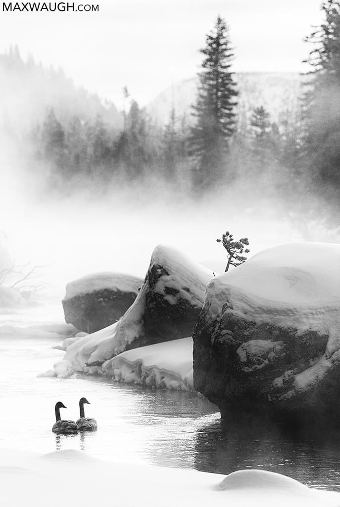
I understood that the philosophy and approach a photographer takes when it comes to their own work might vary based on their intended audience. So as my career progressed, I found myself loosening up a bit. If someone requested alterations to an image for a print sale, my inner journalist bristled, but my more laid back artistic half would occasionally allow it. I also began experimenting more and more with black and white. I soon realized that this medium, in particular, was making the editing process more interesting. The actual picture-taking side of photography has always been the fun part of the job for me. Processing images on a computer, on the other hand, I find to be mind-numbing. But exploring the possibilities of monochrome imagery freed things up a bit and allowed me to get more creative.
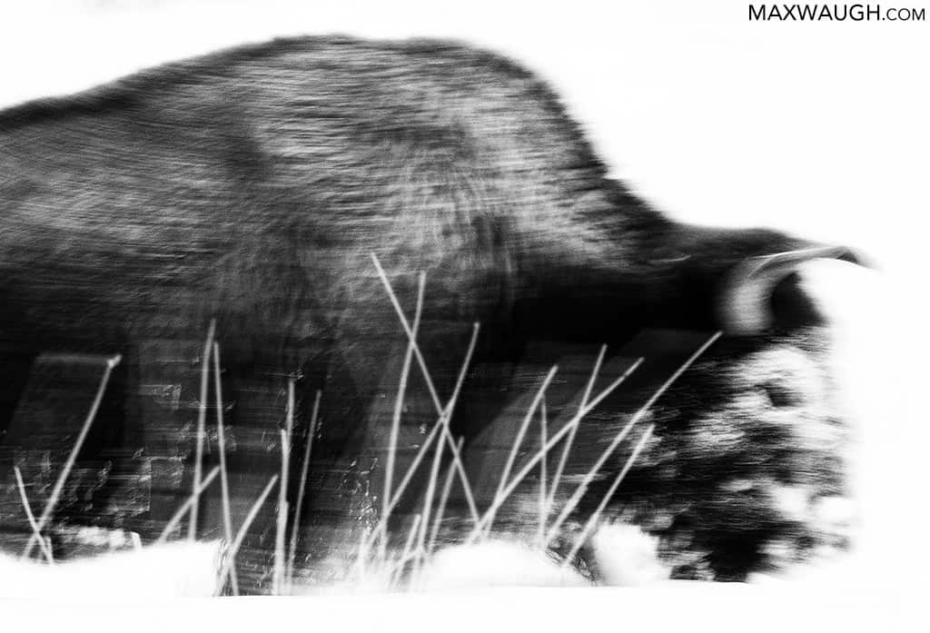
The main reason I felt okay with this? I think I convinced myself that the moment we step away from the color world, we observe every day and dive into shades of gray, a photo immediately become less accurate or faithful to the moment. Monochrome conversion is the first step toward full-blown digital illustration (compare this to photography 60-70 years ago, when black and white photography was the standard for accurate documentation!). It sort of feels like I am declaring that I’m no longer documenting something with a journalistic eye, I’m just focusing on creating a piece of art. And I don’t appear to be alone in this belief. Even a big photo competition with strict rules like Wildlife Photographer of the Year allows adjustments involving dodging and burning in their Black and White category. It’s one small artistic flourish allowed in a contest that doesn’t otherwise permit excessive processing or illustration.
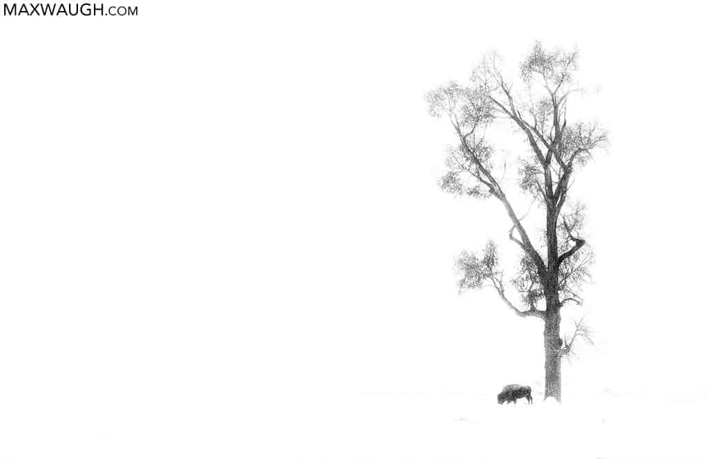
There’s a lot to like about exploring the monochrome world. We strip away a major element when we remove color, so one might think a black and white photograph doesn’t offer as much as a color image. But I find that it distills the remaining elements—tones, lines, shapes, textures—and makes them so much more powerful. In some cases the image is no longer about the nature of the subject itself, as much as a study of graphics and how they tie together.
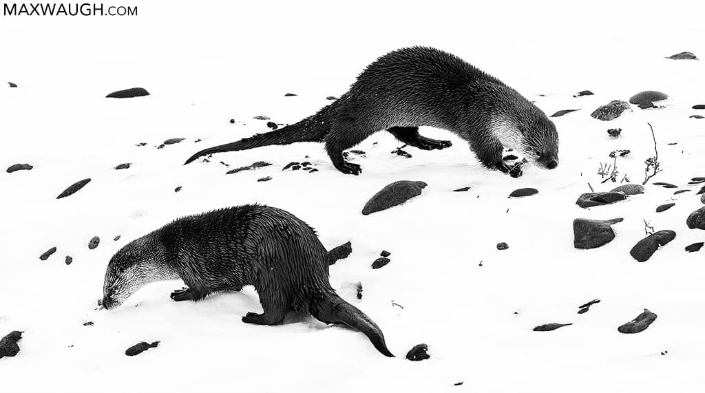
I recall one individual railing against black and white conversions, citing them as examples of a “photographer who didn’t do a good enough job of capturing or conveying the colors that were present” (paraphrased). I do take a lot of crappy color photographs. I’d wager 60% of my subjects and environments are dominated by some variation of brown or gray tones, so that’s not a good start if you’re trying to wow people with color. Finding subjects in ideal, saturated golden light isn’t always the easiest thing to do either. But am I immediately opening up my black and white editing software every time an image is lacking interesting or eye-catching color? Not at all.
I will, however, look for shapes and lines that could be emphasized more effectively in monochrome.
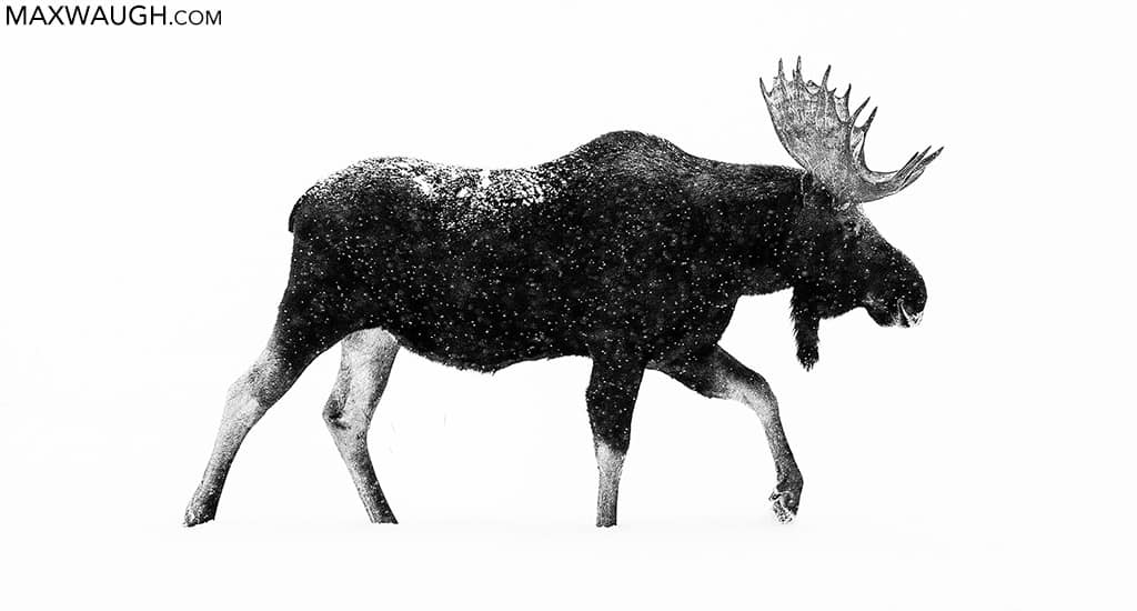
Finding the best way to highlight these elements may lead me down different paths. I don’t process every black and white image the same way. Some may end up sporting an overexposed, high key look, perhaps a minimalist composition with scant details.
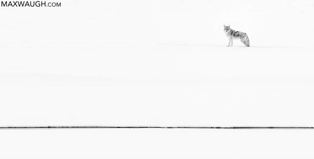
Others will primarily be dark. Some photos will be rendered as a high contrast scene, with extreme blacks silhouetted against stark whites. Others will be processed as high dynamic range photos, presenting a wide gamut of tones in clouds and other surfaces to present more depth (a style I think looks quite tacky in color).
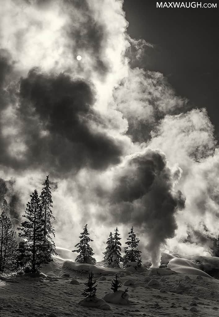
Vignetting? I never added it to an image until I found a particularly moody black and white scene that was enhanced by some added darkness along the edges. I’ve still only done it once or twice, but it’s something I would have never considered in a color shot. Some monochrome photos end up looking far noisier than I’d ever want to see in a color image. But the extra grittiness and texture sometimes enhances the mood. And I’m not strictly attached to pure black, white, and gray tones. An occasional sepia caste might feel best… last year I even overlaid cooler, bluish tones on my black and whites for the first time. My process continues to evolve, and I still reach extremes that don’t make me feel entirely comfortable. Attacking every small imperfection in an image with a dodge here and a burn there sends me down that illustration rabbit hole pretty quickly. I still have mixed feelings about it.
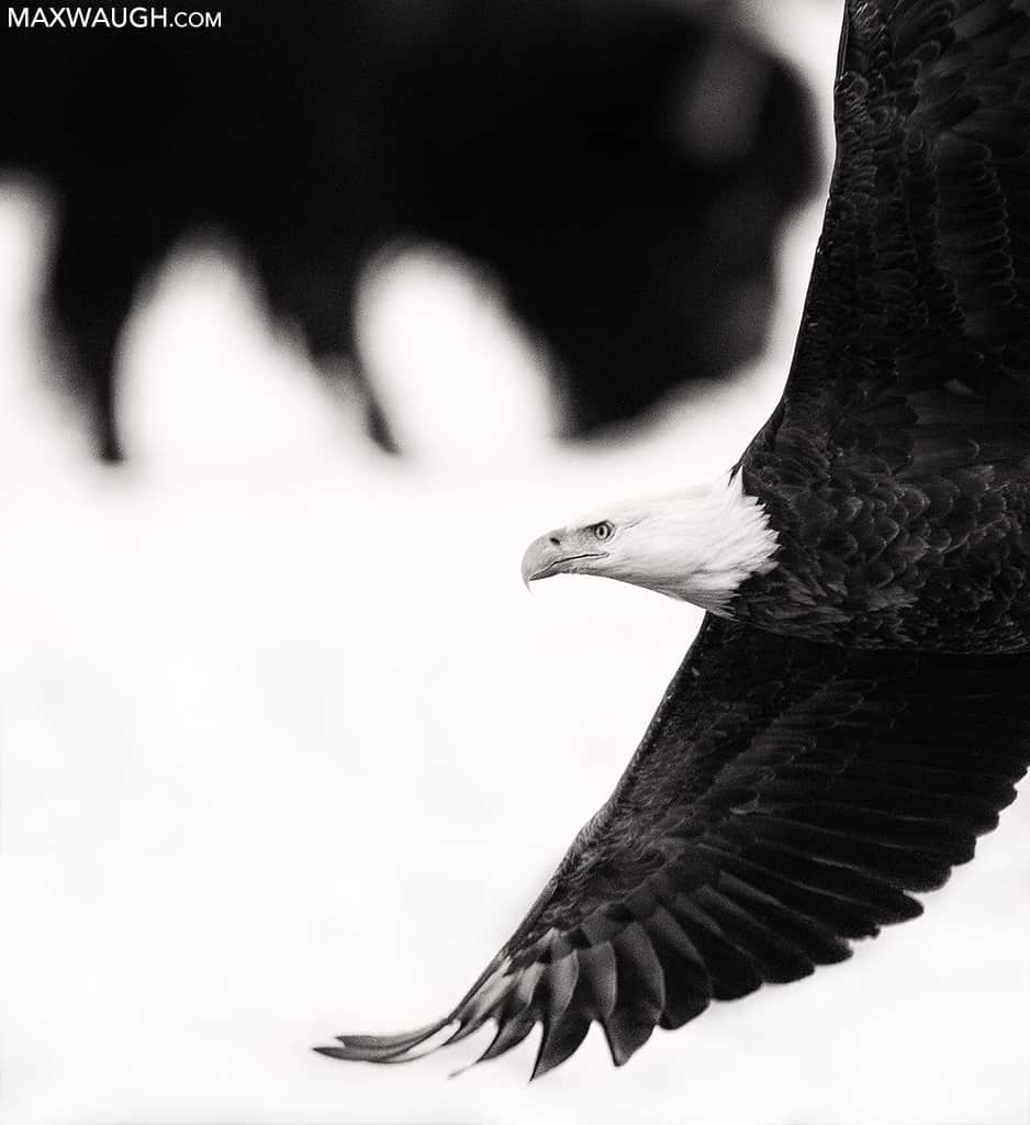
And I still refuse to approach my color photography this way, unless specifically requested to do so by a client or customer, but is that the next step in my evolution? Maybe I should start limiting the basic documentary shots I publish and focus more on art. Creating prettier color images by over-blurring my backgrounds, sandwiching exposures to the point of adding a hazy, glossy sheen to my landscapes, and cleaning out every bit of bright backlight, obtrusive grass and annoying twigs with my healing and cloning brushes would probably sell more prints and increase my social media following. But I haven’t quite evolved to that point yet.
A New Perspective Behind the Lens
One thing I’ve begun to notice in recent years is that I am thinking much more in black and white. For the first time, I may study a scene and think this would look good in monochrome, rather than just discovering that fact afterward on the computer. It’s led to a few more of those enjoyable creative post-processing moments but has also made shooting even more interesting. I’m not only looking at scenes with different tones in mind, but with what is literally a different perspective. While some wildlife photographers struggle to train themselves to shoot wider and capture the greater environment around their subjects, I’m finding myself exploring super-tight shots even more, in case there are abstract shapes or patterns to be discovered in my subjects.
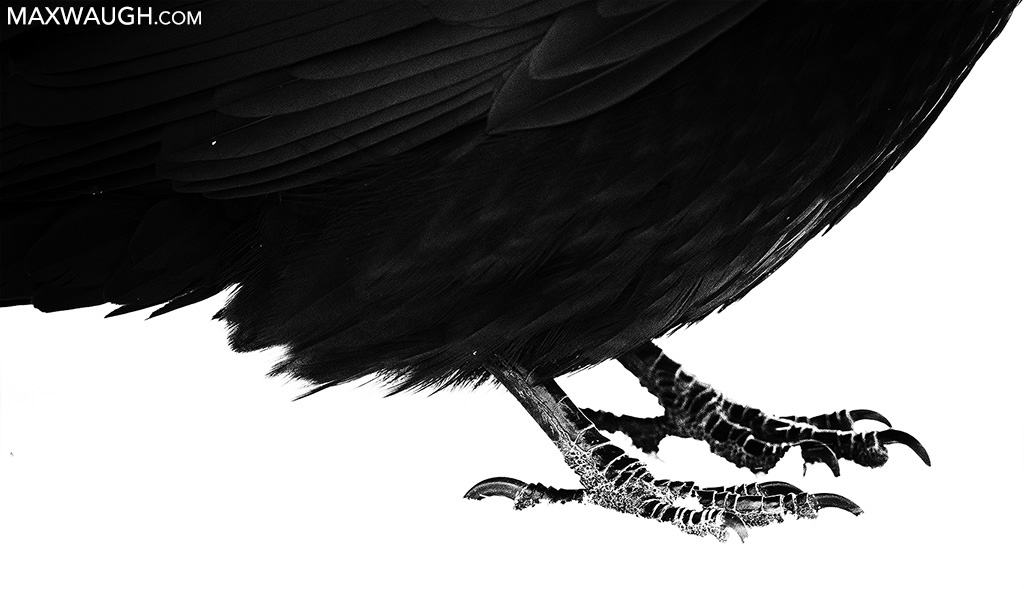
It’s also made me more tolerant and open-minded about my work. Shots that in the past would come across as abject failures from a color documentary perspective might get a second chance when viewed from an abstract monochrome viewpoint.
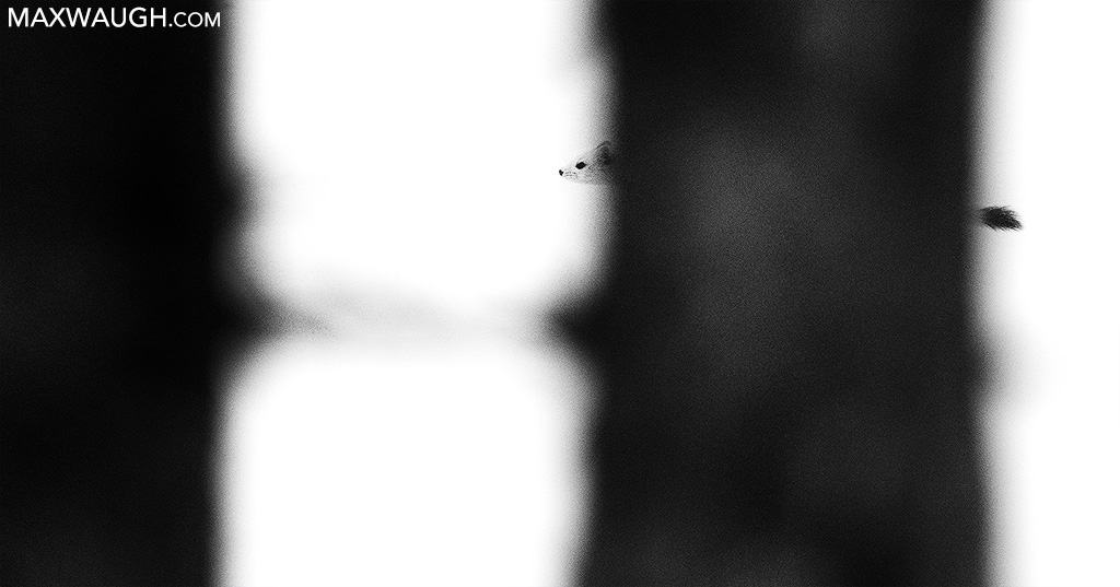
As it turned out, this winter Yellowstone trip was fantastic, and not just because of the excellent wildlife activity I witnessed. Though I didn’t have a concrete strategy going into the trip, I ultimately did come away with a number of monochrome images and abstracts that I enjoyed creating and editing. Somehow I achieved my goal for this trip without quite knowing how I’d get there. I think a more open-minded philosophy and being able to more readily embrace the artistic flourishes of black and white were the key to a lot of the satisfaction I felt coming home from this adventure. Hopefully, that attitude carries over to future outings… it may open up a world of possibilities.

