Good photography is not what you expect. What I mean by this is that the process of making an effective photograph is often counterintuitive, especially for beginners but sometimes even for advanced photographers. To excel at photography, you must learn to stop seeing the world the way everyone else sees it, and to rather see the world the way your camera sees it. To excel as an artist, you must start seeing how the limitations of your camera’s ability to capture the world are artistic opportunities instead.
For example, your camera cannot simultaneously capture the same range between light and dark that human eyes can see, and while this might limit your camera’s ability to capture a scene the same way that the eye sees it, you can use exposure settings to render the scene artistically instead, such as creatively using silhouette. Also, a camera cannot record motion the same way it is perceived by the human eye, but clever use of shutter speed can allow you to render motion as an artistic cumulative blur with a long exposure, or with a fast shutter speed, you can freeze a moment, magically suspending it in time forever. Learning to see the world how your camera sees it is a critical first step to unlocking these powerful creative choices.
But the single most difficult, most counterintuitive aspect of photography, the one thing that most photographers have a tough time wrapping their heads around, is this: your subject is not your subject. Instead, your subject is just part of the overall visual design. The subject might arguably be the primary element of the design, perhaps the most important part, but it is only a part, nonetheless. To make truly exceptional photographs, you need to include more than just your subject; you also need to include other visual elements that work together with your subject, getting the viewer engaged with the story you are telling with your image.
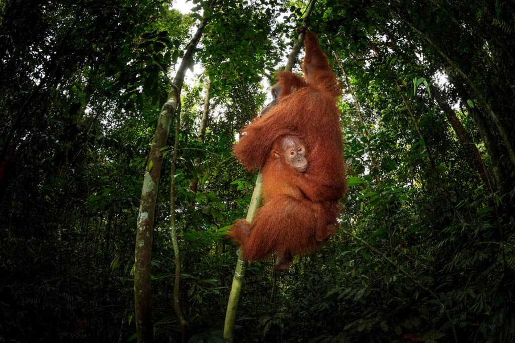
With nature subjects, this often means taking a wider view. That doesn’t necessarily mean using wide-angle lenses, although it often does. With wildlife, this might mean simply resisting the urge to zoom in tight on your subject. Although I enjoy making tight portraits of wildlife from time to time, my very best wildlife photos take a wider view, including the animal’s surroundings as well. It is often said that this is done to “show the wildlife subject in its habitat,” but for me, it is a way to bring in other compositional and story-telling elements, and to make more sophisticated visual designs. I like to bring in the sky when I can, especially if the clouds are colorful and interesting, just like I would when making grand landscape photos.
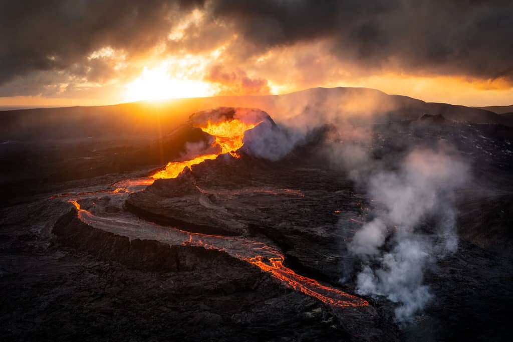
For landscape subjects, taking a wider view often means using wide angle perspectives (personally, I love working with ultra-wide lenses, they are my favorite for just about any type of photography that I do). The challenge of working with wide angle lenses is that, by taking in a broader view of a given scene, compositional complexity increases. Simply put, working with six visual elements is easier than working with sixty. Good composition requires skill no matter what lens you use but finding a way to successfully include elements rather than eliminating them is in many ways more challenging.
When working with wide angle lenses, objects close to the lens appear abnormally large relative to more distant objects, and distant objects appear abnormally small. Not only does this exaggerate scale differences and thus enhance the appearance of depth, but it also helps simplify the composition: potentially distracting background elements, when reduced in scale, can often be effectively rendered less noticeable. The viewer focuses their attention on what’s relatively big, and by making your foreground big by getting close, you draw the viewer’s eye to this “visual anchor” to start their exploration of your composition.
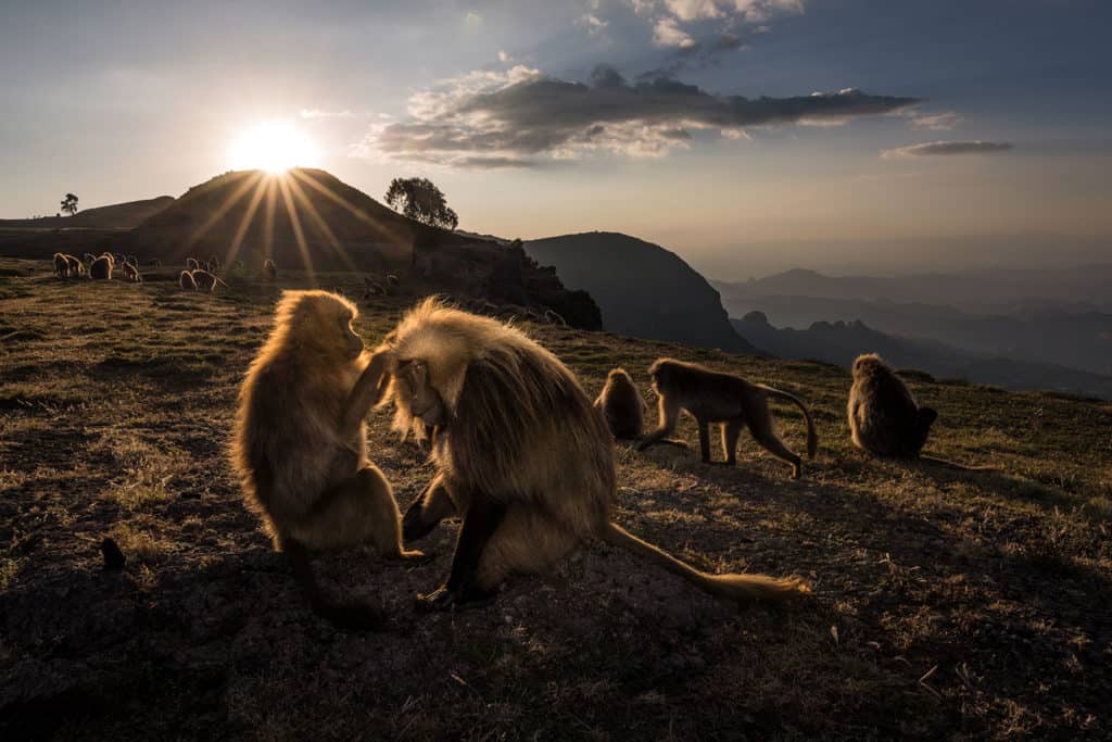
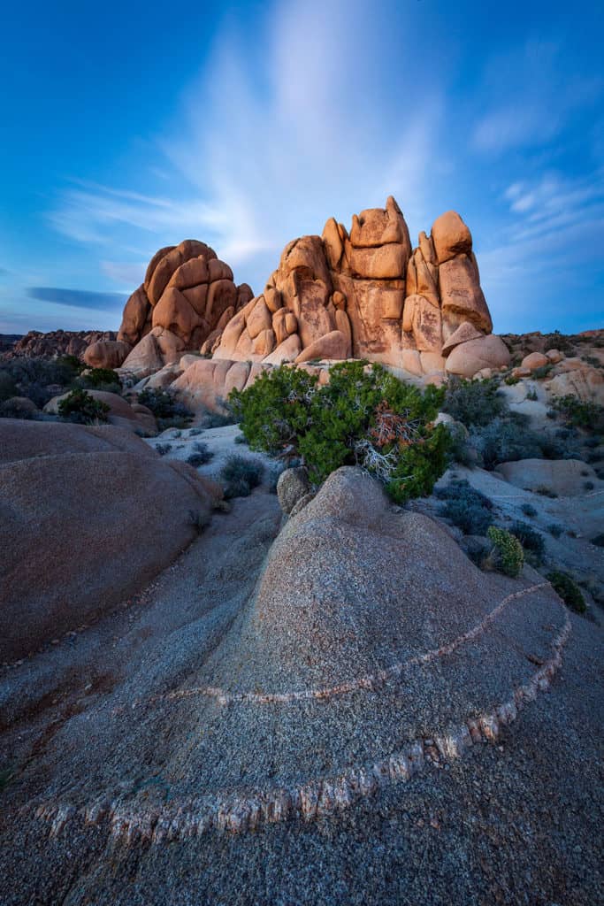
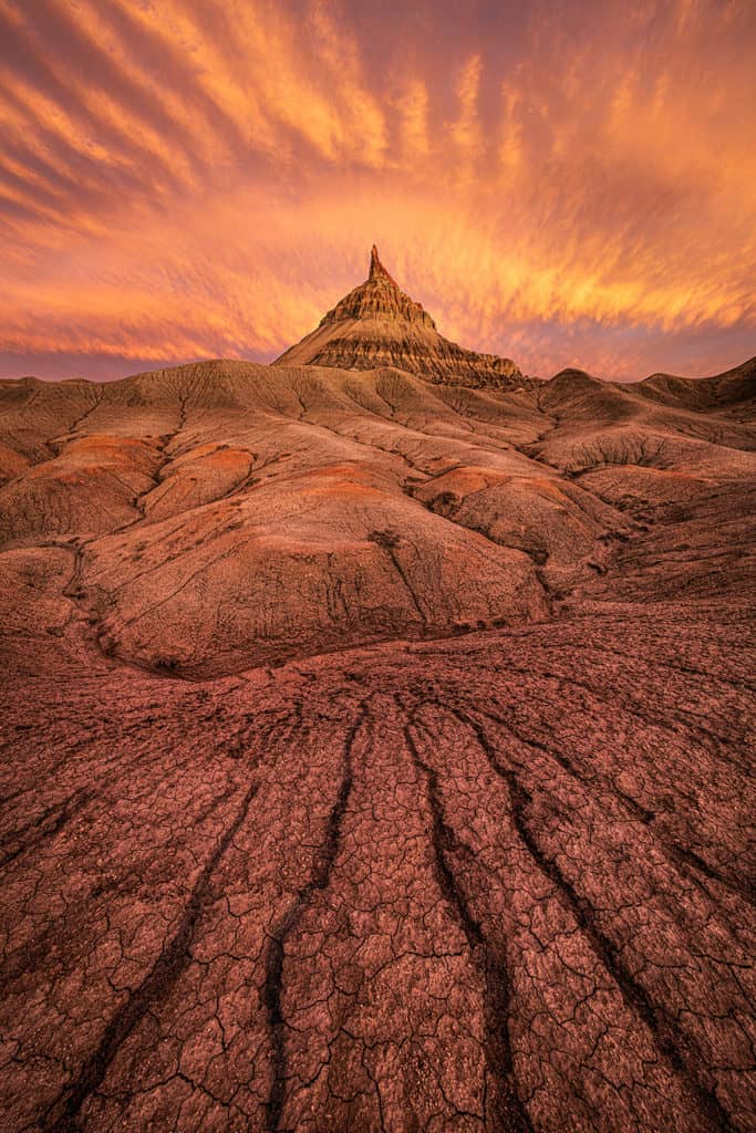
The trick to working with wide angle lenses is to get close to that visual anchor. With landscape photos, the visual anchor is usually some interesting object that is found in the foreground, quite often something literally at the feet of the photographer. Successful wide-angle landscapes are often taken several feet, or even several inches, away from the foreground element. Small foregrounds require you to get a lot closer to make them loom large in the final composition. In these types of images, the subject—the incredible landscape scenery you are there to photograph—gets pushed to the background, while the foreground—the stuff you were walking over and that most photographers overlook—becomes more prominent. Arguably, the foreground is the most important part of a successful wide-angle, near-far landscape composition, and as a result landscape photographers often spend much more time searching for an interesting foreground that they do looking for an interesting background.
Once you learn to stop thinking of your subject as your subject, you instead start seeing your subject as an abstract compositional element, which is a necessary step for making compelling photos. You start to see your subject in terms of its shape, color, and luminosity value. Seeing shapes and learning how to arrange them effectively within the picture frame is of critical importance to successful composition. All objects create shapes or are made up of multiple shapes, and the visual interaction of multiple objects can create implied shapes. Shapes can also be created by the alternation of shadow and light. Wildlife subjects can create interesting shapes when they strike certain poses. Learning to see these shapes, and using shapes to construct your compositions, is an important first step to making compelling visual designs.
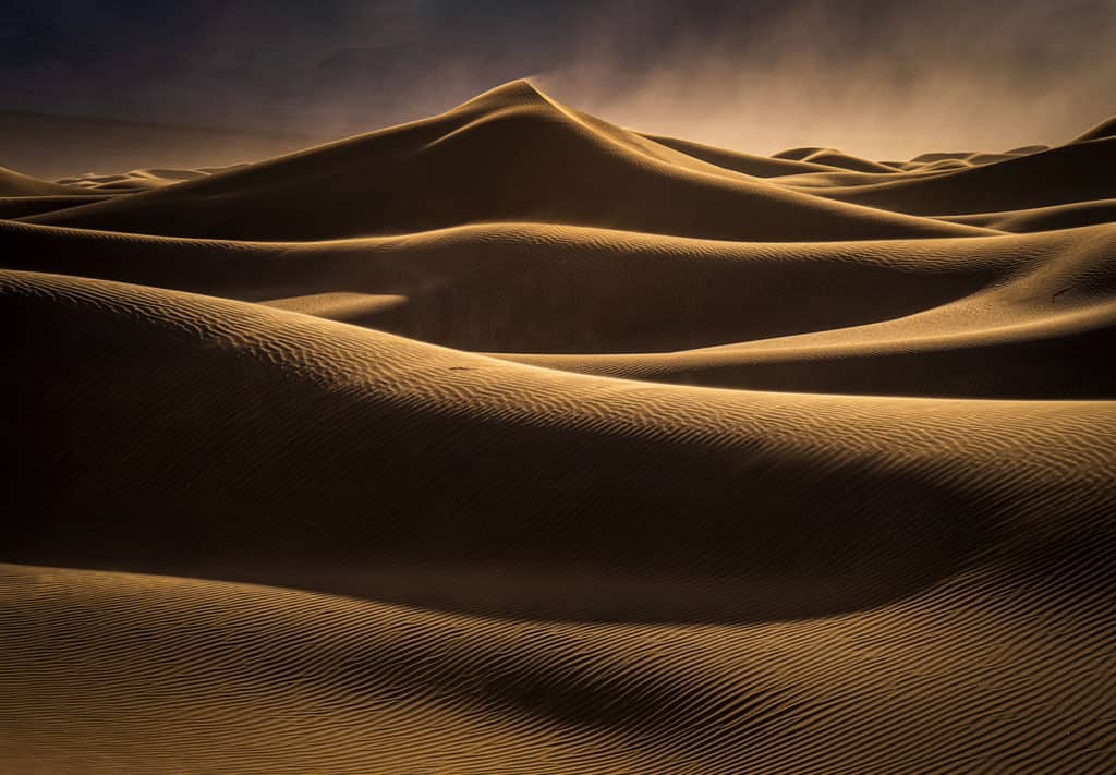
Successful photo composition is, in a sense, nothing more than a process of figuring out how to make all the disparate shapes in your composition play together nicely. Your job as a photographer is to find the optimal combination of position and focal length to arrange all the visual elements in a scene in a pleasing manner, and then wait for the peak moment when the light is best to trigger the shutter button. This is true whether you are photographing landscapes or wildlife, although arguably it is easier with landscape subjects that aren’t likely to get spooked by the photographer moving around to find the best spot for shooting.
In a sense, then, your “subject” is actually your entire visual design. In a finely balanced composition, no one visual element is more important than any other. Think of photographic composition as a symphony: everything in the scene has its proper role to play, and by removing one element, you diminish the whole.
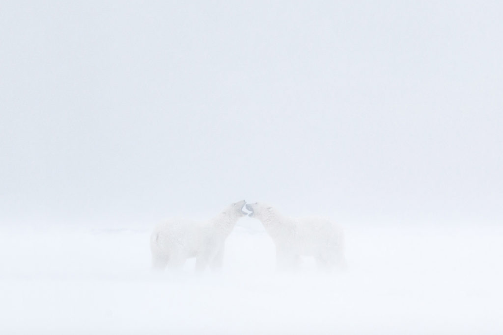
In conclusion, stop thinking of your subject as your subject. Resist the temptation to zoom in tight on your subject, whether you are shooting landscapes or wildlife. Instead, zoom out and take a wider view. Look to include other interesting visual features and put something in between you and your subject to enhance visual interest and to create the illusion of depth. If you can successfully learn to see your subject in abstract terms, especially shape, you will start making more sophisticated visual designs that better tell the story of your subject and are more likely to appeal visually and emotionally to your viewers, thus deepening their connection to your photographs.

